Offices of American Spaces - Case Study
U.S. State Department Fellowship, Diplomacy Lab Project.
American Spaces are places located around the world, whether it’s in universities, embassies, or private entities, they work similarly to libraries here in the United States. American Spaces offer free English classes, learning resources, information, and advice to those who want to study in the U.S., and easy access to expensive technologies such as 3d printing machines and recording booths.
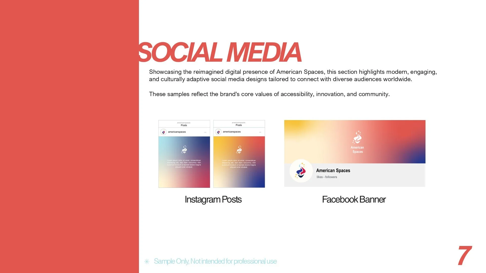
For this Project, I was responsible for the brand's logo, as well as its color palette and social media mockups. The representatives from the Offices of American Spaces wanted their new logo to be identifiable as an American symbol to those seeking their services, but that could also be disguised as a generic brand to maintain security in places where the U.S. is not welcome.
I made several sketches with some identifiable American icons such as football, eagles, stars, and torches. And other things that symbolized education, such as books, graduation cap, etc.


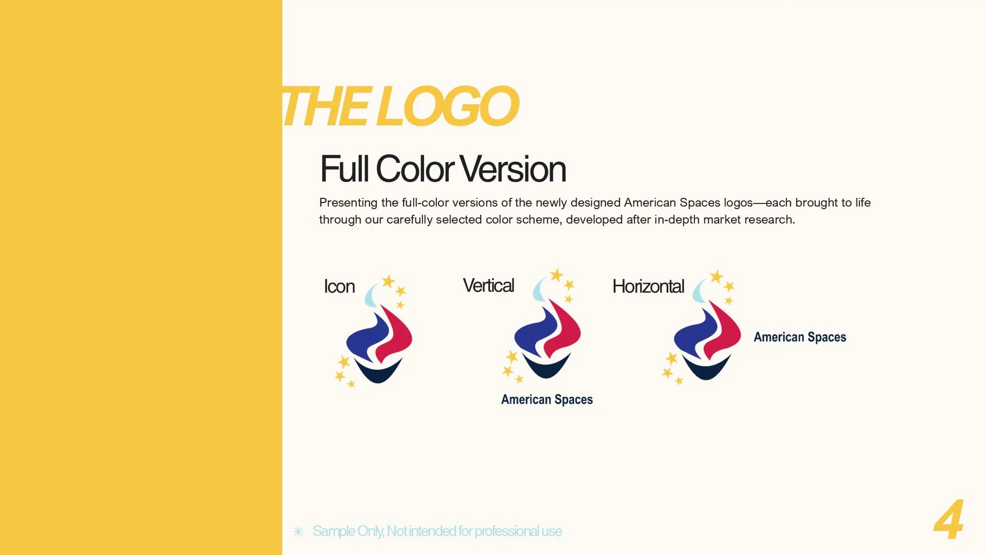
My team decided to explore the concept of the torch with the stars as it would pull from the historical symbolism of the Statue of Liberty, which was gifted to the U.S. people by the people of France as a commemoration of their friendship, the centennial of U.S. independence, and the end of slavery. This new icon would represent a bridge formed between the people of the U.S. and the people in other countries where American Spaces are located; a commemoration of these new opportunities brought to their communities by the provided resources.
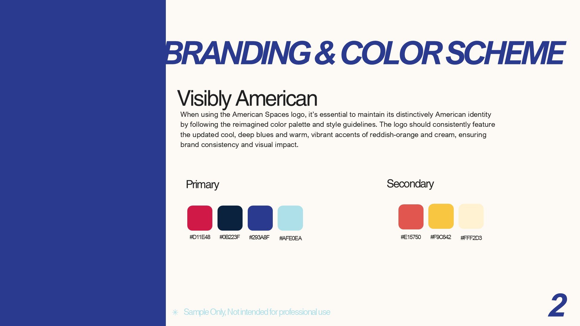
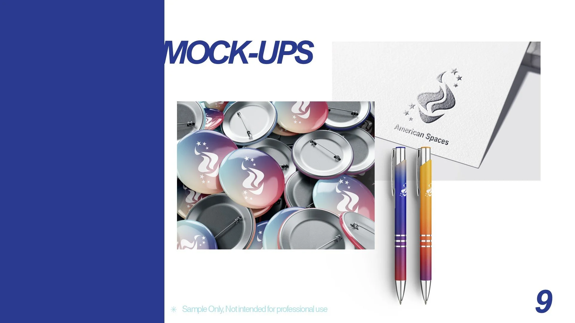
For the color palette, we decided to keep the red, white, and blue found in their original logo and also add warmer colors like yellow, orange, and cream to make it a little more palatable to an audience of college and university students and stray away from that governmental look.
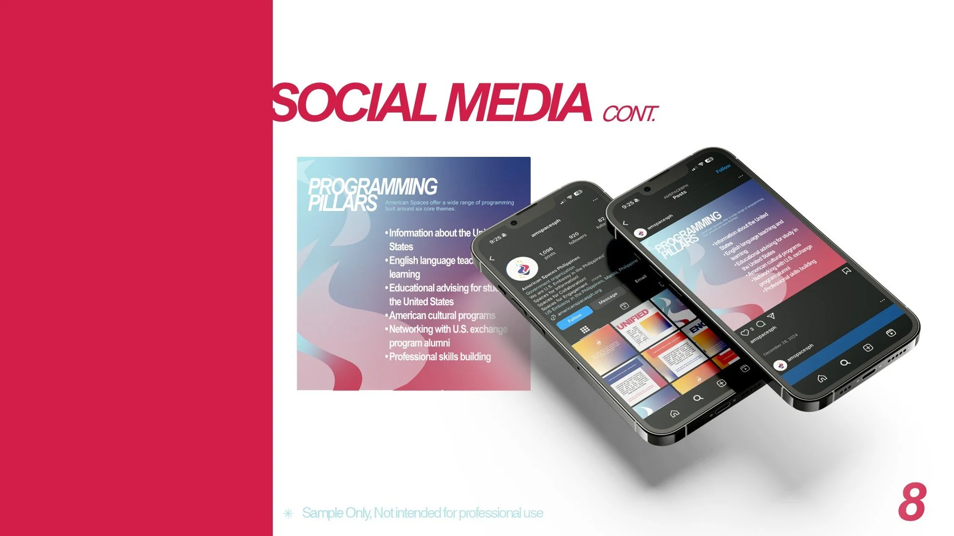
The long tail of the torch reminded us of an ice cream cone so we decided to change it to a rounded base. We also decided to feature 6 stars that would represent the 6 pillars of the organization.
Final Logo
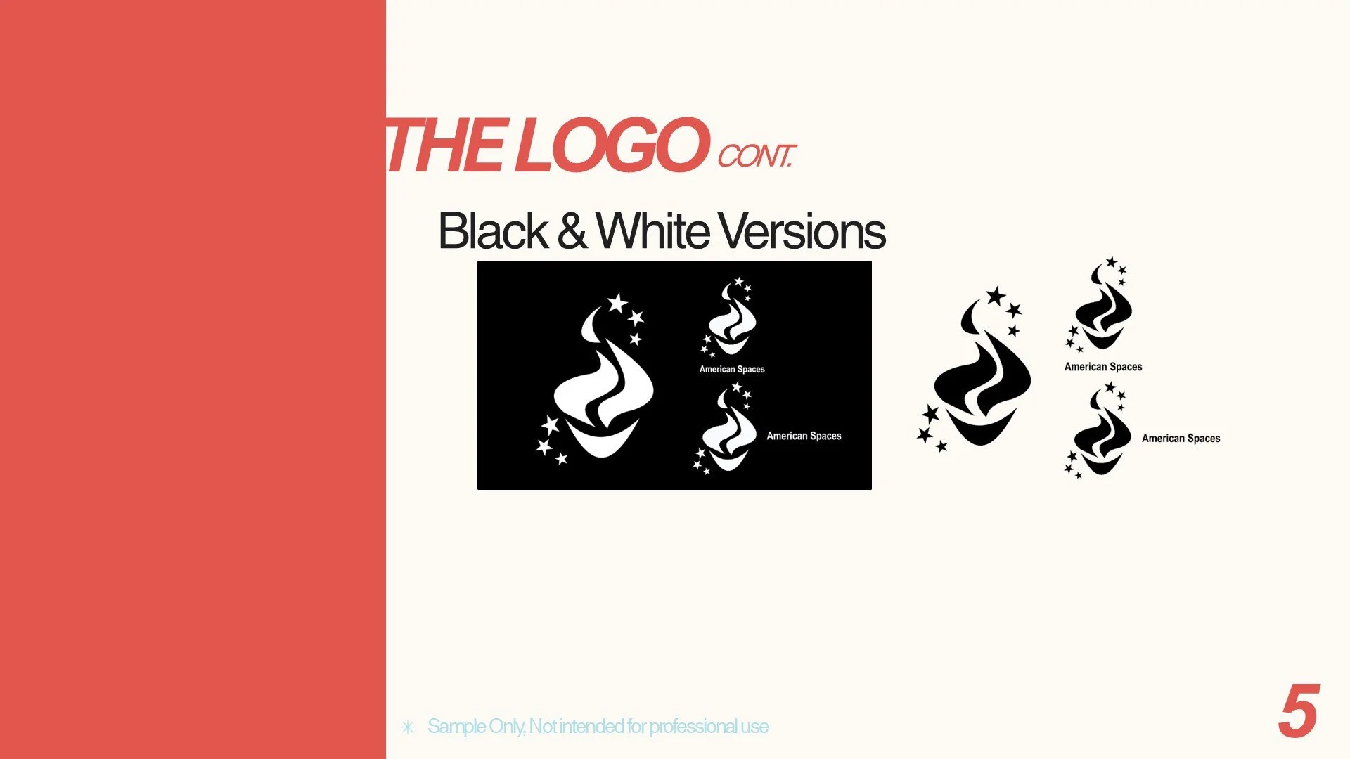
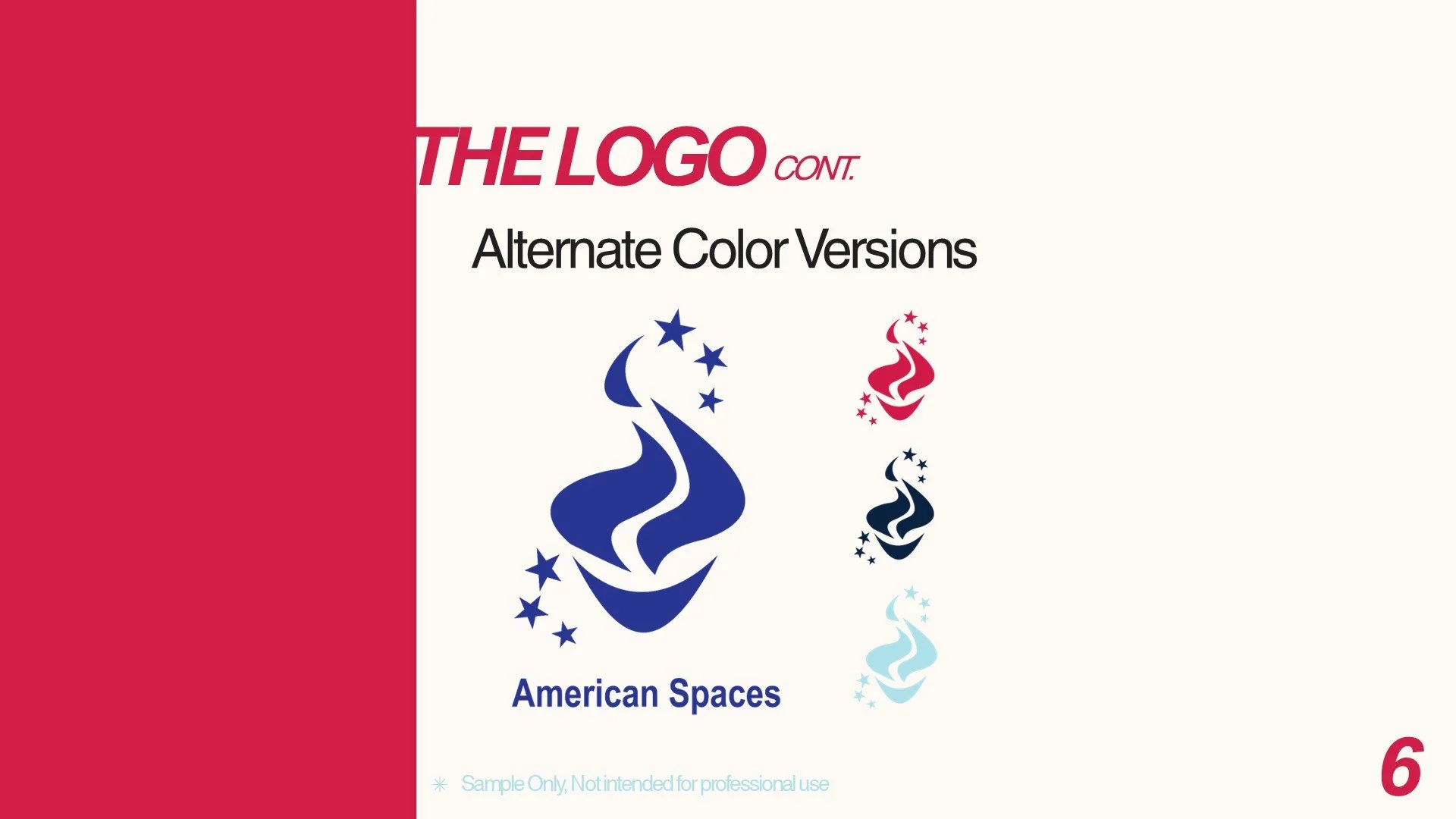
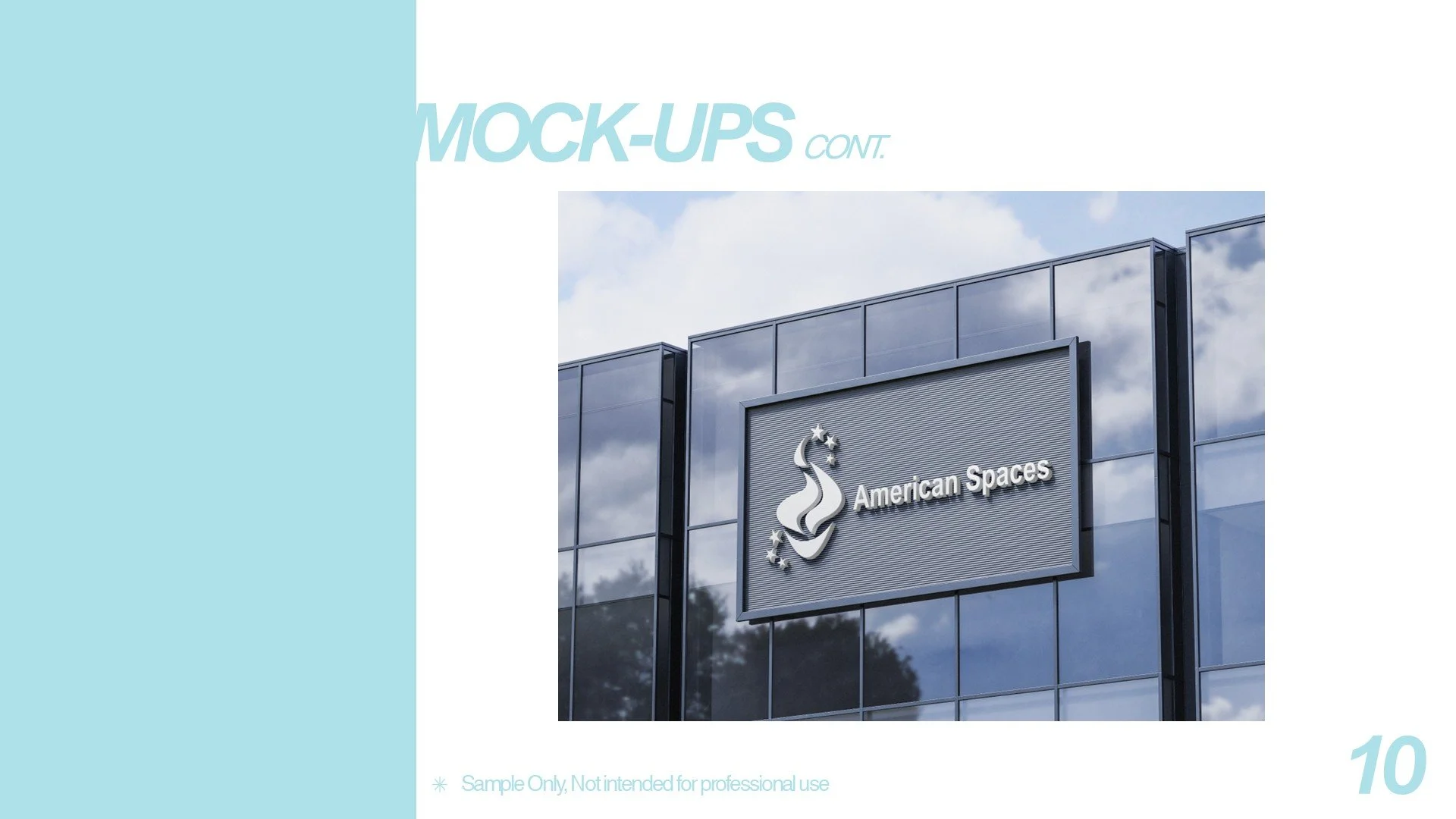
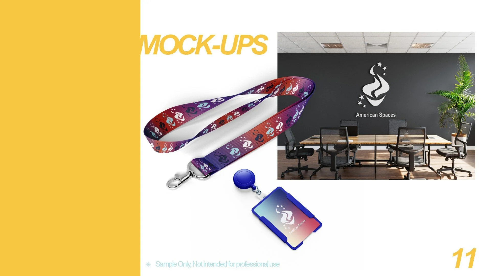
The complete Brand and Style Magazine is featured below, it includes alternate versions of the logo I made. I was responsible for the layout and design of the magazine, as well as the graphics for the mockups.