Diplomacy Lab Project
Florida State College at Jacksonville & US State Department Research Fellowship
Offices of American Spaces
As part of a research fellowship in collaboration with the U.S. Department of State’s Diplomacy Lab, I worked on a visual redesign initiative for the Offices of American Spaces. The project integrated audience research with brand development, exploring how visual identity and storytelling could strengthen engagement across print, digital, and social platforms.
I designed the proposed logo and developed cross-platform mockups to illustrate how the identity could scale across various touchpoints. The final work was presented to State Department representatives in Washington, DC.
American Spaces are cultural and educational centers located worldwide in universities, embassies, and partner institutions. Functioning similarly to public libraries in the United States, they provide free English classes, academic resources, advising for studying in the U.S., and access to technologies such as 3D printing and recording studios.
The primary challenge was to create a mark that felt distinctly American to those seeking its services, while remaining subtle enough to function as a neutral brand identity in regions where overt U.S. symbolism may pose security concerns.
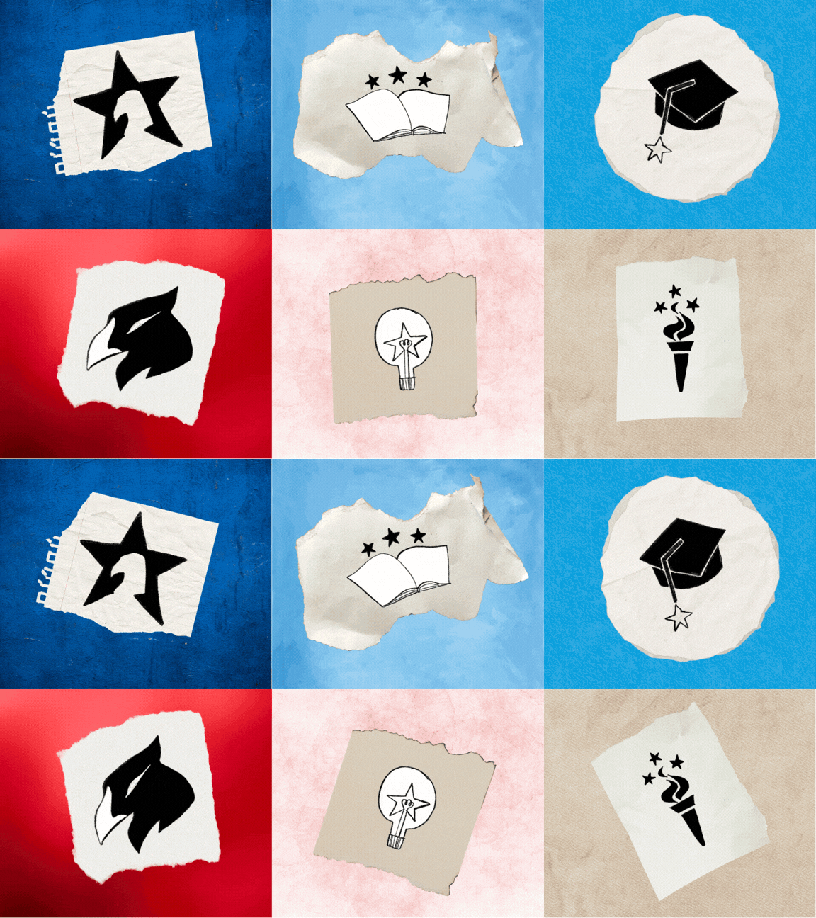
To explore this balance, I developed a series of sketches drawing from recognizable American imagery — including stars, eagles, torches, and football references — alongside symbols associated with education and opportunity, such as books and graduation caps. These early explorations allowed me to test how direct or abstract the identity could be while maintaining clarity and purpose.

My team decided to explore the concept of the torch with the stars as it would pull from the historical symbolism of the Statue of Liberty, which was gifted to the U.S. people by the people of France as a commemoration of their friendship, the centennial of U.S. independence, and the end of slavery. This new icon would represent a bridge formed between the people of the U.S. and the people in other countries where American Spaces are located; a commemoration of these new opportunities brought to their communities by the provided resources.

The long tail of the torch reminded us of an ice cream cone so we decided to change it to a rounded base. We also decided to feature 6 stars that would represent the 6 pillars of the organization.
Final Logo

Color Palette
For the color palette, we decided to keep the red, white, and blue found in their original logo and also add warmer colors like yellow, orange, and cream to make it a little more palatable to an audience of college and university students and stray away from that governmental look.